FADQ historical crops data
By Johanie Fournier, agr. in rstats tidyverse
May 20, 2022
FADQ here in Quebec, is generous enough to put on their website all the historical data of crop used for each Quebec’s fiend back to 2003. You can find it here
I download all of it on my computer and you can find the process in this github repro.
Now, let’s see what we got in this data set!
Get the data
board_prepared <- pins::board_folder(path_to_file, versioned = TRUE)

data <- board_prepared %>%
  pins::pin_read("centroid")

head(data)
##           x        y   an  idanpar suphec culture_fadq
## 1 -78.72440 48.41762 2003 12388602    5.9     paturage
## 2 -77.92157 48.23231 2003 13489650   12.5         foin
## 3 -79.38860 48.75419 2003  9809436   13.2         foin
## 4 -78.04803 48.36055 2003 12382926    9.6         foin
## 5 -79.38775 48.60837 2003 12384941   11.6         foin
## 6 -79.02590 48.69386 2003  9809848   12.5     paturage
Explore the data
In this dataset, IDANPAR is a unique ID for each combination field/year. X and Y are GPS coordinate.
First, I want to look at the number of field we have for each year.
ggplot(data) +
  geom_histogram(aes(an),
    position = "identity", binwidth = 1,
    fill = "#DBBDC3", color = "black"
  ) +
  labs(
    title = "Frequency Histogram for Year",
    x = " "
  )
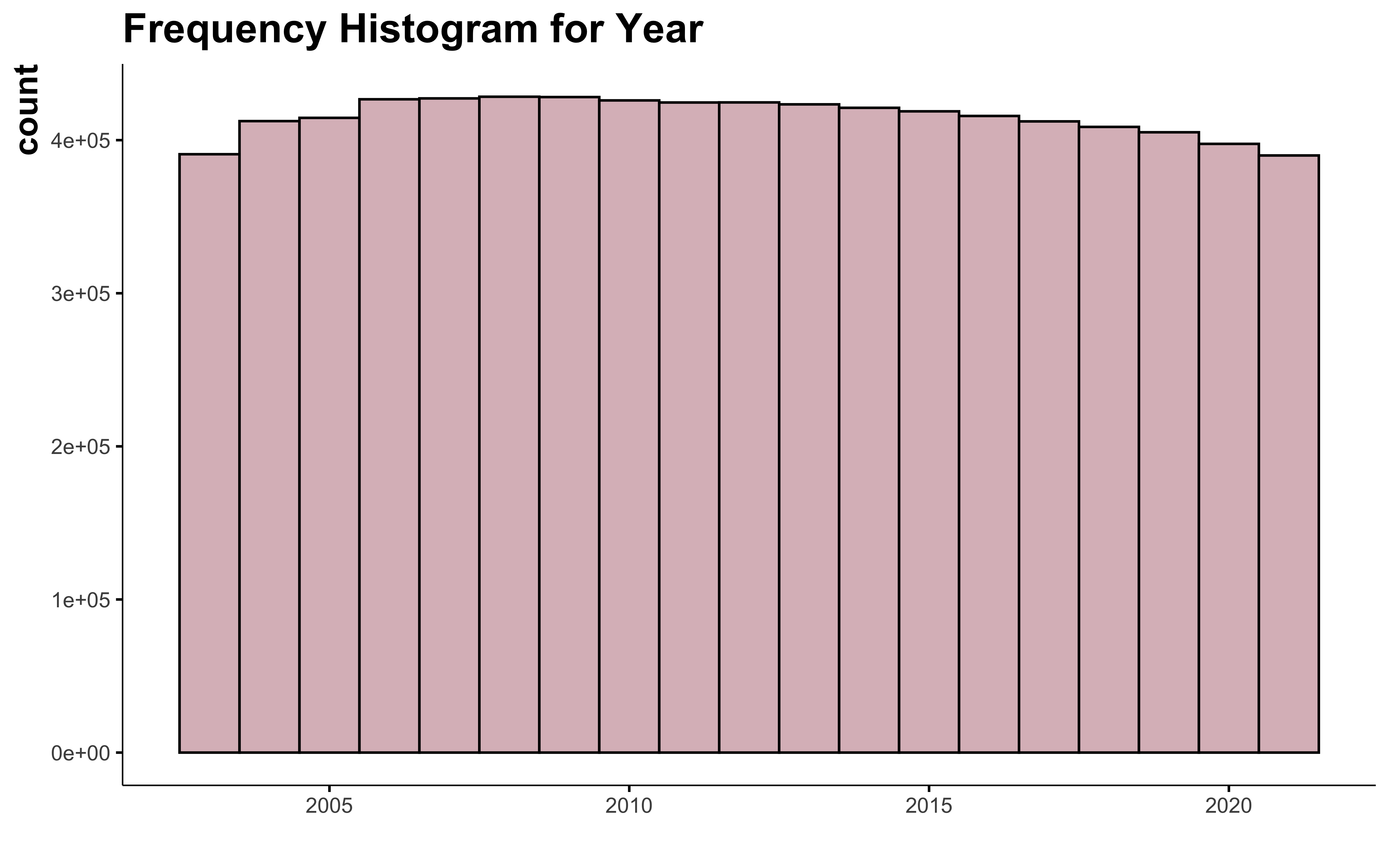
The number of information available for each year is constant. This doesn’t represent all the cultivated field of Quebec, because adhesion to FADQ is not mandatory, but this gives a pretty good idea.
Let’s have a look at the crop.
data %>%
  count(culture_fadq) %>%
  filter(n >= 5000) %>%
  ggplot(aes(reorder(culture_fadq, n), n)) +
  geom_bar(stat = "identity", fill = "#DBBDC3", color = "black") +
  coord_flip() +
  labs(
    title = "Frequency Histogram for Crops",
    x = " "
  )
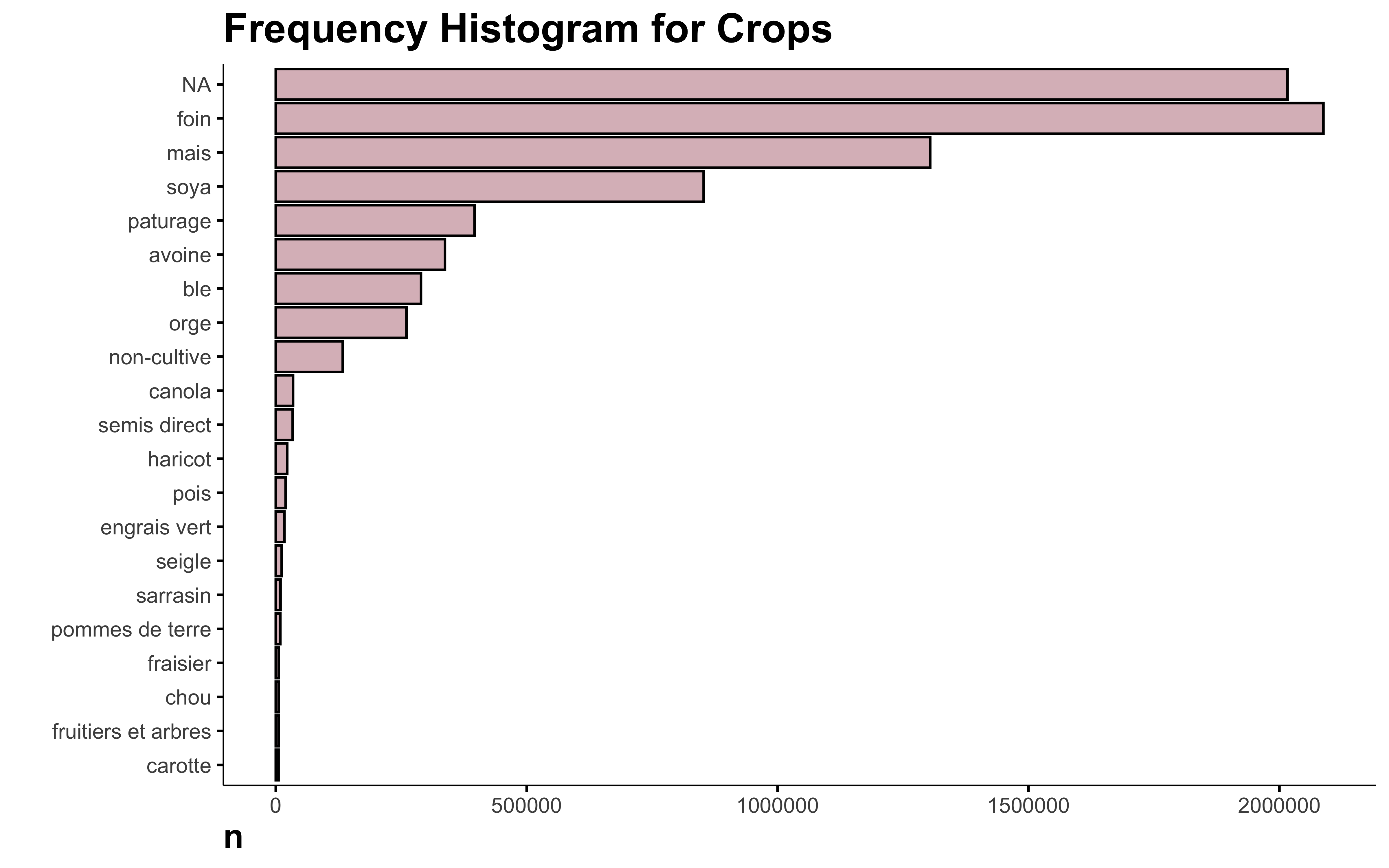
Why is NA the main crop in this data? I looked in the original data and there are indeed a lot of missing crops. Since this information is not available, I think it’s safe to delete those lines.
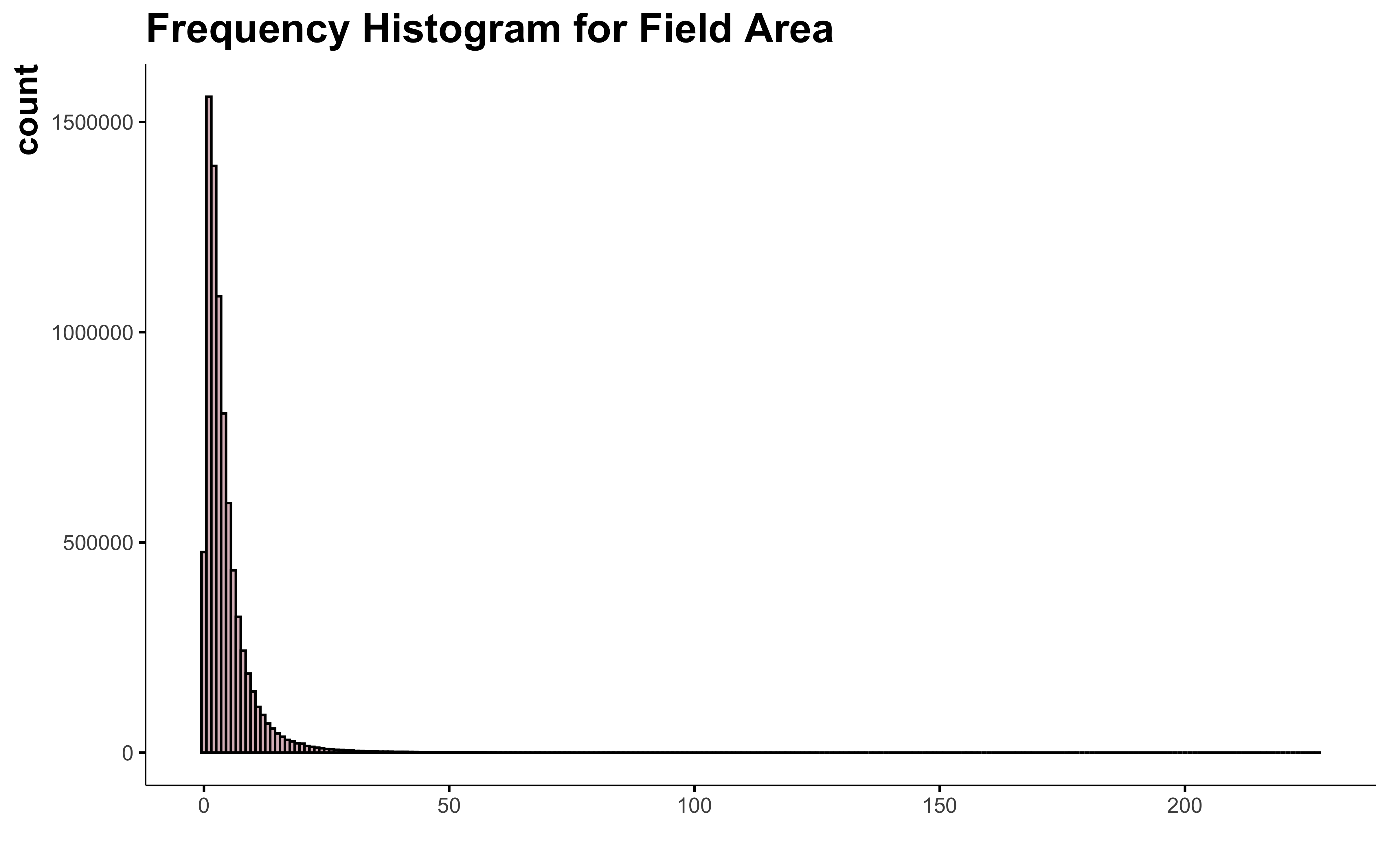
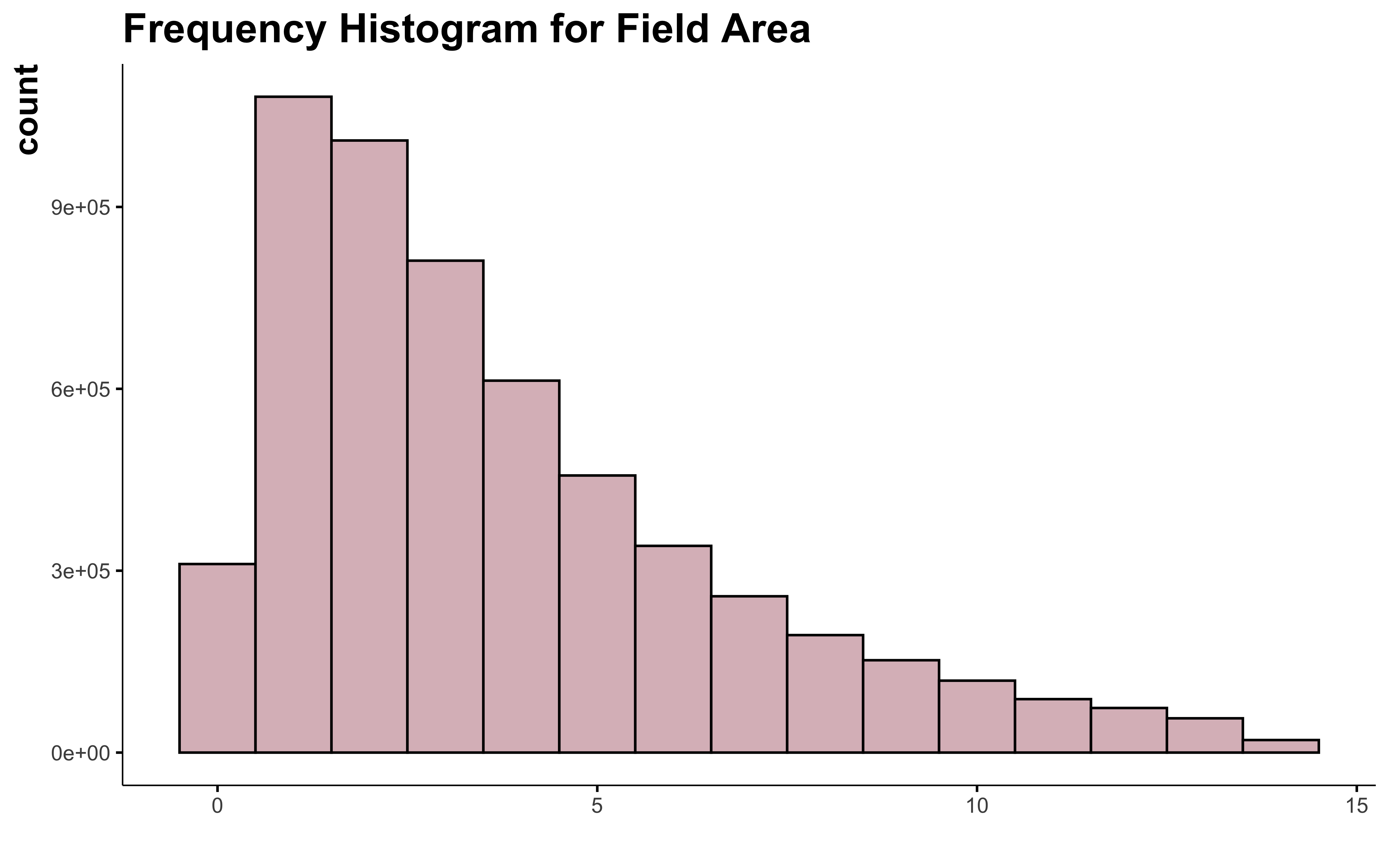
Now let’s see how the field area look like.
ggplot(data) +
  geom_histogram(aes(suphec),
    position = "identity", binwidth = 1,
    fill = "#DBBDC3", color = "black"
  ) +
  labs(
    title = "Frequency Histogram for Field Area",
    x = " "
  )
ggplot(data) +
  geom_boxplot(aes(suphec), fill = "#DBBDC3", color = "black") +
  labs(
    title = "Boxplot for Field Area",
    x = " "
  )
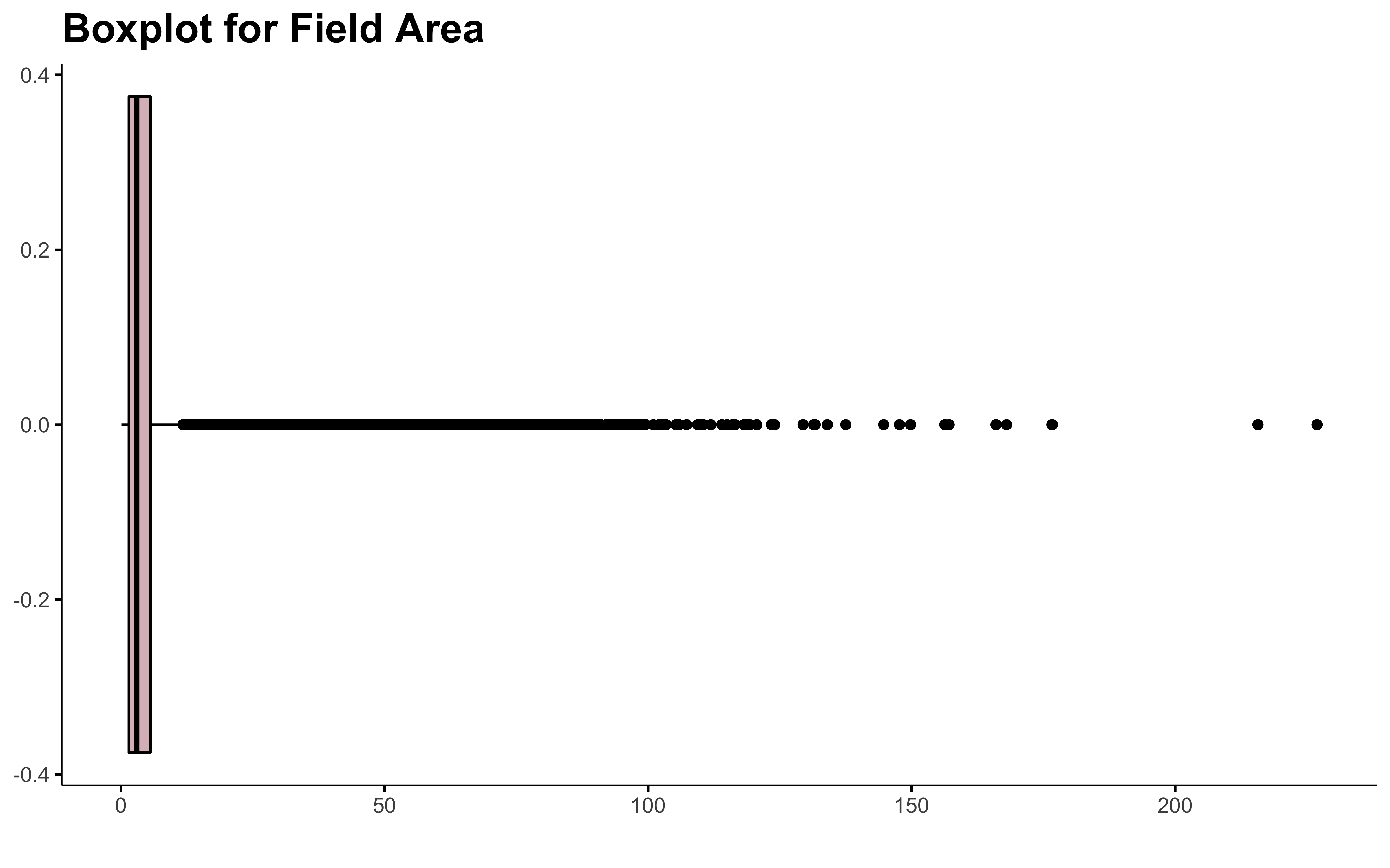
data %>%
  select(suphec) %>%
  my_inspect_num()
| Name | Min | Q1 | Med | Mean | Q3 | Max | SD | NA (%) |
|---|---|---|---|---|---|---|---|---|
| suphec | 0 | 2 | 3 | 4 | 6 | 227 | 5 | 0 |
There are field of more than 200 ha in Quebec! 😨 Let me know, I don’t want to walk all this to get the soil samples 😄 !
There is a lot of outliers in this. Dealing with outliers is always tricky. I don’t even have found the perfect recipe yet.
So before I can have fun with this data set, it need a bit of cleaning:
- Remove NA crop
- Simplify crop list
- Remove outliers in field area
Tidy data
Simplify Crops
data_clean_crops <- data %>%
  filter(!is.na(culture_fadq)) %>%
  mutate(groupe = case_when(
    grepl("foin|panic|feverole|semis direct", culture_fadq) ~ "hay",
    grepl("avoine|ble|orge|seigle|sarrasin|triticale|millet|canola|sorgho|tournesol|epeautre|lin|chanvre", culture_fadq) ~ "cereals",
    grepl("pommes de terre", culture_fadq) ~ "potato",
    grepl("framboisier|framboise|fraisier|fraise|pommier|bleuet|bleuetier|arbustes|coniferes|gadellier|camerise|vigne|poire|canneberges|fruitiers et arbres", culture_fadq) ~ "trees and fruits",
    grepl("paturage", culture_fadq) ~ "pasture",
    grepl("soya", culture_fadq) ~ "soy",
    grepl("mais", culture_fadq) ~ "corn",
    grepl("haricot|chou|brocoli|melon|laitue|oignon|piment|celeris|carotte|panais|radis|rutabaga|zucchini|tomate|betterave|cornichon|rabiole|endive|ail|artichaut|asperge|aubergine|poireau|fines herbes|topinambour|celeri-rave|aneth|epinard|pois|rhubarbe|citrouille|courge|concombre|chou-fleur|tabac|gourganes|echalottes|feverole|navets", culture_fadq) ~ "vegetables",
    grepl("non-cultive|tourbe|engrais vert", culture_fadq) ~ "not cultivated",
    TRUE ~ as.character(.$culture_fadq)
  ))

data_clean_crops %>%
  count(groupe, sort = TRUE) %>%
  DT::datatable()
The crop list look much better now! ✨. Time to deal with the field area outliers.
I mainly use 3 ways of dealing with them:
-
- The 5% out
-
- Hampel X84 calculus, a robust outliers detection technique that label as outliers any point that is more than 1.4826 x MADs (median absolute deviation) away from the median.
-
- Box-Cox transformation
I usual look at the 2 first and chose the one that make the mean and the median the closest (good indication of normal distribution). If I can stay away from transformation I will.
5% Out
summary(data_clean_crops$suphec)
##    Min. 1st Qu.  Median    Mean 3rd Qu.    Max.
##   0.100   1.600   3.200   4.731   5.900 226.900
quantile(data_clean_crops$suphec, c(0.05, 0.95))
##   5%  95%
##  0.5 13.9
data_clean_crops %>%
  filter(suphec <= 13.9) %>%
  ggplot() +
  geom_histogram(aes(suphec),
    position = "identity", binwidth = 1,
    fill = "#DBBDC3", color = "black"
  ) +
  labs(
    title = "Frequency Histogram for Field Area",
    x = " "
  )
95% of the field contain in this dataset have an area smaller than 13.9 ha. This exclude a lot of field. Is all the field with more than 14 ha all outliers? I don’t think so…
Hampel X85
var <- data_clean_crops$suphec

upper_limit <- median(var) + 1.4826 * 2 * mad(var)
upper_limit
## [1] 11.55279
data_clean_crops %>%
  filter(suphec <= upper_limit) %>%
  ggplot() +
  geom_histogram(aes(suphec),
    position = "identity", binwidth = 1,
    fill = "#DBBDC3", color = "black"
  ) +
  labs(
    title = "Frequency Histogram for Field Area",
    x = " "
  )
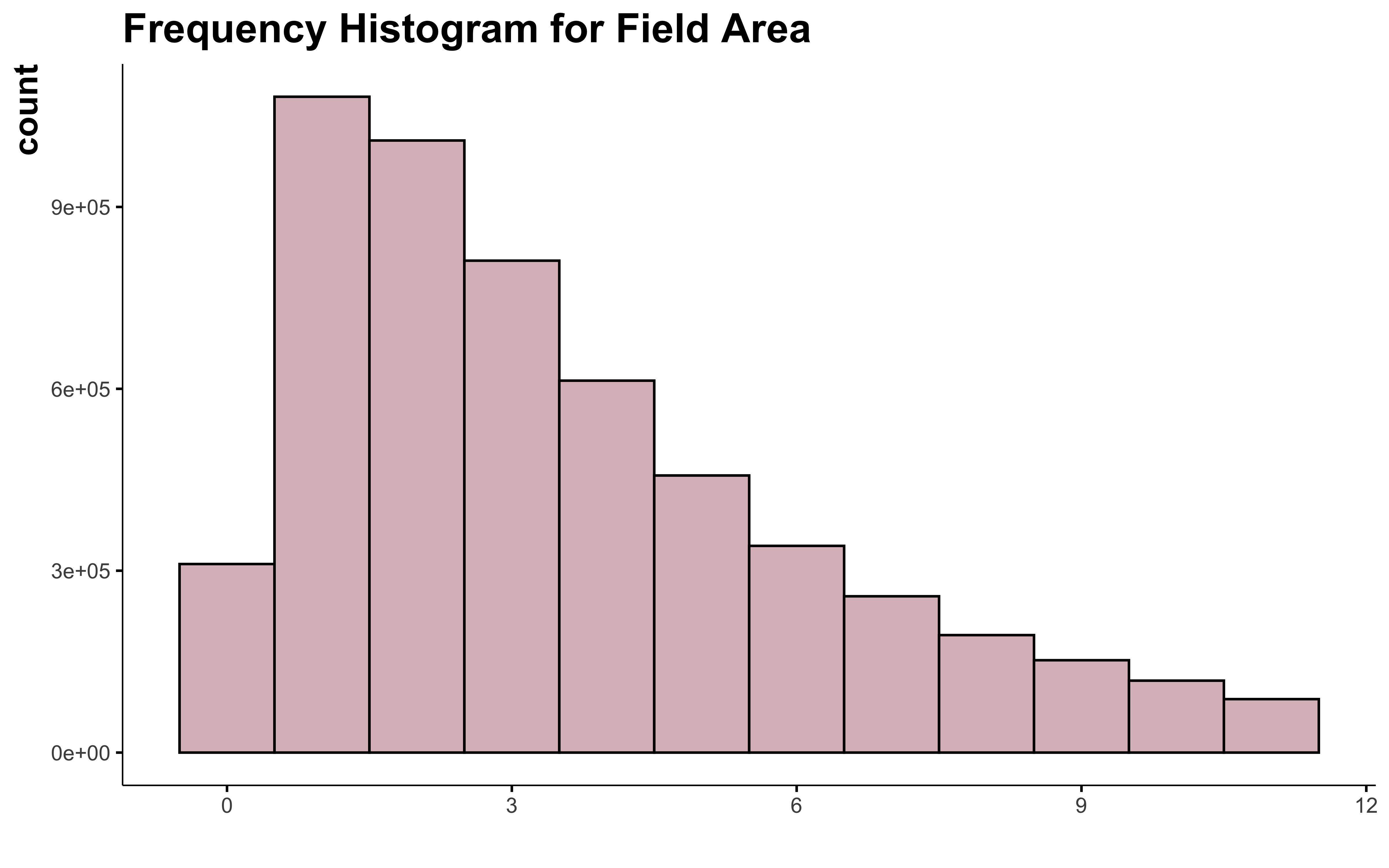 OK, I can see that in this case the Hampel X84 method make the distribution of the variable more normal. But I still can’t consider all the field over 12 or 14 ha as outliers. And this doesn’t help much to normalize the shape of the curve.
Box-Cox Transformation
I try to avoid transformation at any cost. It usually just make a mess in the interpretation of the model accuracy. In some case, I can’t avoid it. I like to use the Box-Cox method to choose the right transformation to use. This technique is quite simple. The most common transformation are presented here:
\(\lambda\) |
Transformation |
|---|---|
| -2 | \(\frac{1}{x^2}\) |
| -1 | \(\frac{1}{x}\) |
| -0.5 | \(\frac{1}{\sqrt(x)}\) |
| 0 | \(\log(x)\) |
| 0.5 | \(\sqrt(x)\) |
| 1 | \(x\) |
| 2 | \(x^2\) |
b <- MASS::boxcox(lm(data_clean_crops$suphec ~ 1))
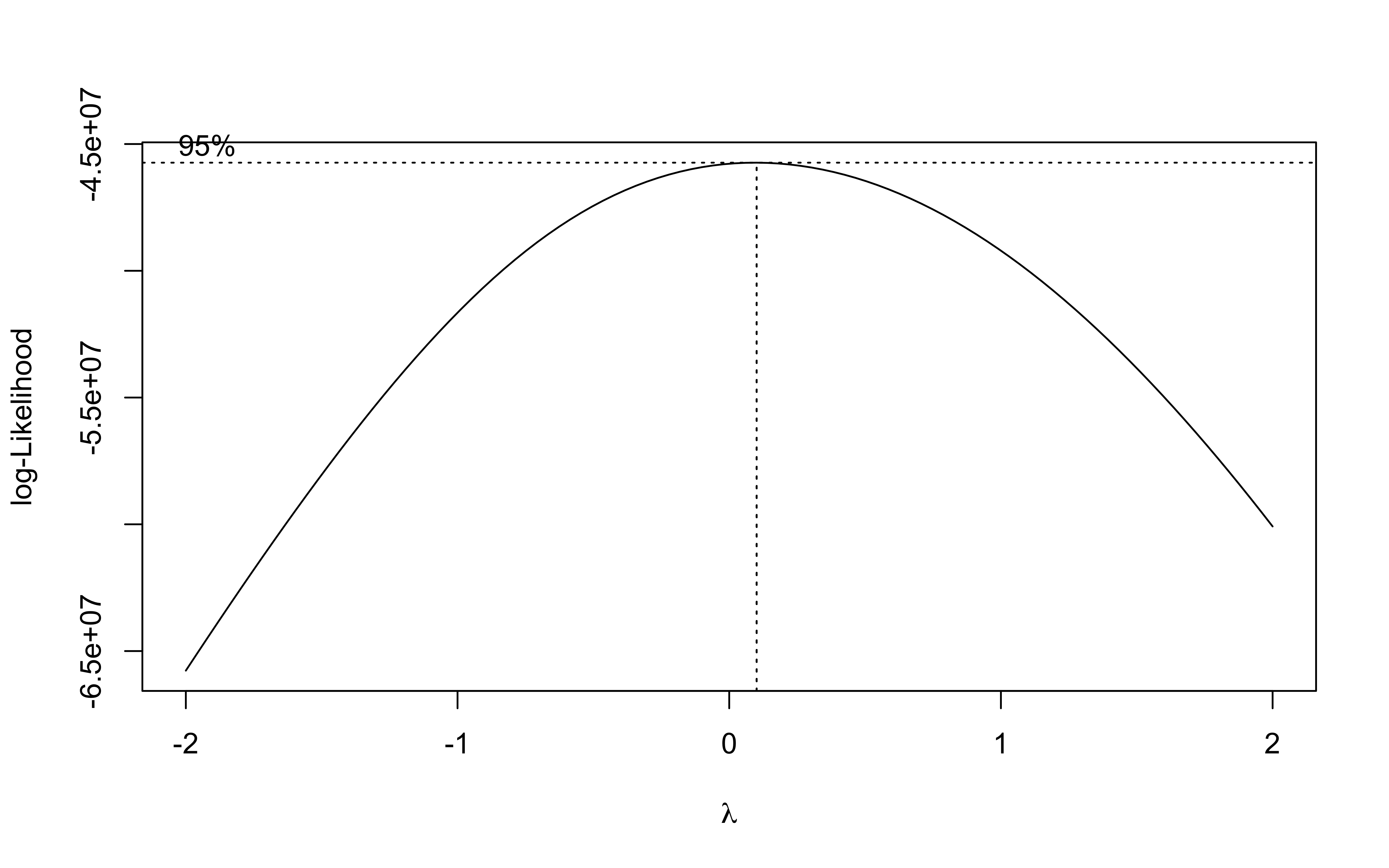
lambda <- b$x[which.max(b$y)]
lambda
## [1] 0.1010101
The best transformation for the field area is the log transformation.
data_clean_crops %>%
  mutate(suphec_log = log(suphec)) %>%
  ggplot() +
  geom_histogram(aes(suphec_log),
    position = "identity", binwidth = 1,
    fill = "#DBBDC3", color = "black"
  ) +
  labs(
    title = "Frequency Histogram for Field Area",
    x = " "
  )
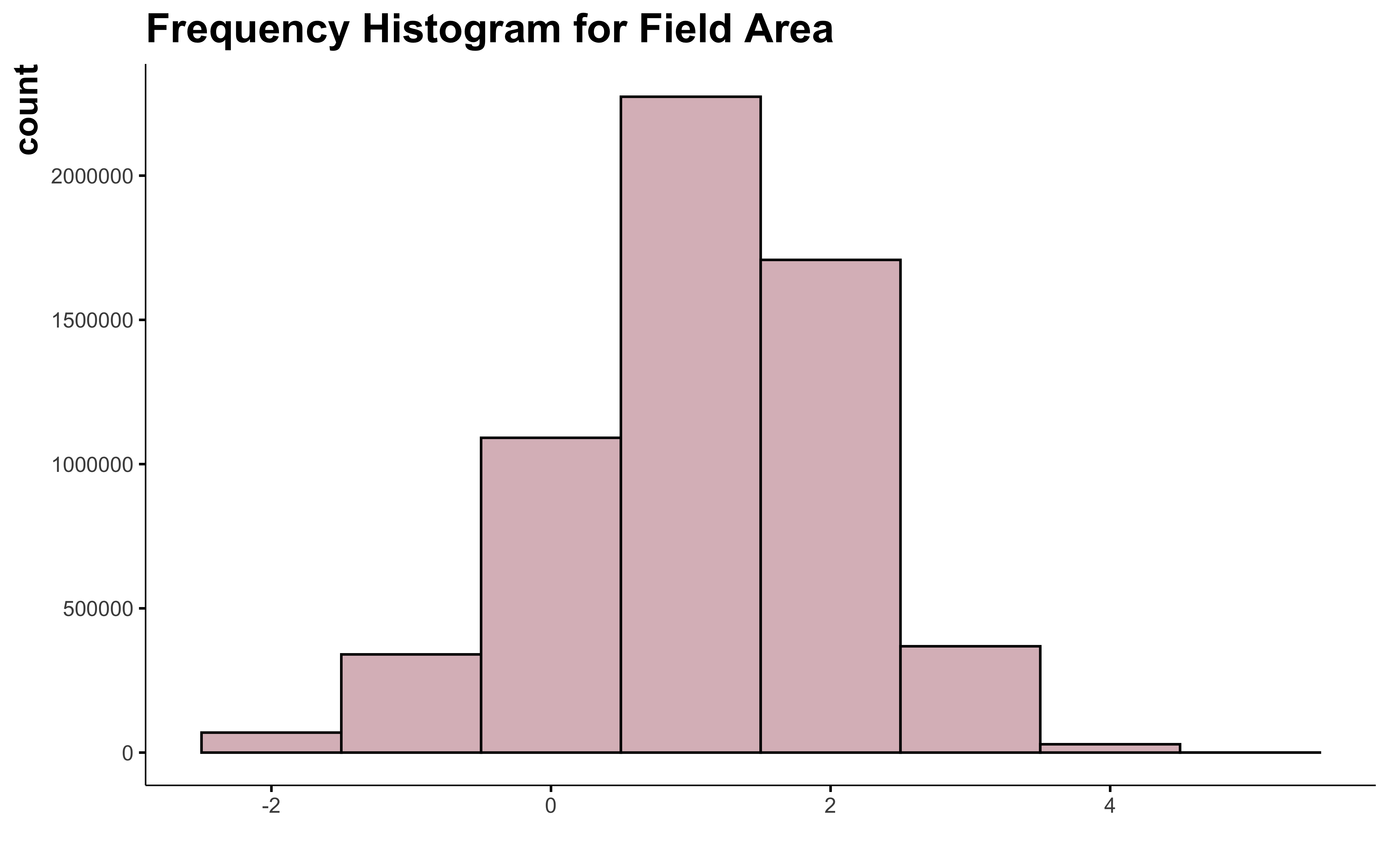
Oh! We got something! The log transformation is the best way to make the field area variable look normal and I can keep all the big field.
Final data set
data_clean <- data %>%
  filter(!is.na(culture_fadq)) %>%
  mutate(culture = case_when(
    grepl("foin|panic|feverole|semis direct", culture_fadq) ~ "hay",
    grepl("avoine|ble|orge|seigle|sarrasin|triticale|millet|canola|sorgho|tournesol|epeautre|lin|chanvre", culture_fadq) ~ "cereals",
    grepl("pommes de terre", culture_fadq) ~ "potato",
    grepl("framboisier|framboise|fraisier|fraise|pommier|bleuet|bleuetier|arbustes|coniferes|gadellier|camerise|vigne|poire|canneberges|fruitiers et arbres", culture_fadq) ~ "trees and fruits",
    grepl("paturage", culture_fadq) ~ "pasture",
    grepl("soya", culture_fadq) ~ "soy",
    grepl("mais", culture_fadq) ~ "corn",
    grepl("haricot|chou|brocoli|melon|laitue|oignon|piment|celeris|carotte|panais|radis|rutabaga|zucchini|tomate|betterave|cornichon|rabiole|endive|ail|artichaut|asperge|aubergine|poireau|fines herbes|topinambour|celeri-rave|aneth|epinard|pois|rhubarbe|citrouille|courge|concombre|chou-fleur|tabac|gourganes|echalottes|feverole|navets", culture_fadq) ~ "vegetables",
    grepl("non-cultive|tourbe|engrais vert", culture_fadq) ~ "not cultivated",
    TRUE ~ as.character(.$culture_fadq)
  )) %>%
  mutate(suphec_log = log(suphec)) %>%
  select(-culture_fadq)

summary(data_clean)
##        x                y               an          idanpar
##  Min.   :-79.54   Min.   :44.99   Min.   :2003   Min.   : 9804822
##  1st Qu.:-73.24   1st Qu.:45.65   1st Qu.:2007   1st Qu.:11704702
##  Median :-72.43   Median :46.17   Median :2011   Median :13610854
##  Mean   :-72.24   Mean   :46.48   Mean   :2011   Mean   :13976700
##  3rd Qu.:-71.03   3rd Qu.:47.10   3rd Qu.:2016   3rd Qu.:16231983
##  Max.   :-61.76   Max.   :50.25   Max.   :2021   Max.   :19363670
##      suphec          culture            suphec_log
##  Min.   :  0.100   Length:5879938     Min.   :-2.303
##  1st Qu.:  1.600   Class :character   1st Qu.: 0.470
##  Median :  3.200   Mode  :character   Median : 1.163
##  Mean   :  4.731                      Mean   : 1.100
##  3rd Qu.:  5.900                      3rd Qu.: 1.775
##  Max.   :226.900                      Max.   : 5.425
🎉 I have a tidy dataset. You can fin it here
- Posted on:
- May 20, 2022
- Length:
- 6 minute read, 1198 words