TyT2019W16 - Stil a Man's World?
By Johanie Fournier, agr. in rstats tidyverse tidytuesday
January 13, 2019
Get the data
women_research <- readr::read_csv("https://raw.githubusercontent.com/rfordatascience/tidytuesday/master/data/2019/2019-04-16/women_research.csv")
## Rows: 60 Columns: 3
## ── Column specification ────────────────────────────────────────────────────────
## Delimiter: ","
## chr (2): country, field
## dbl (1): percent_women
##
## ℹ Use `spec()` to retrieve the full column specification for this data.
## ℹ Specify the column types or set `show_col_types = FALSE` to quiet this message.
Explore the data
summary(women_research)
##    country             field           percent_women
##  Length:60          Length:60          Min.   :0.0800
##  Class :character   Class :character   1st Qu.:0.1900
##  Mode  :character   Mode  :character   Median :0.2250
##                                        Mean   :0.2617
##                                        3rd Qu.:0.2825
##                                        Max.   :0.5700
Prepare the data
rank<-women_research%>%
  mutate(country=(ifelse(country=="United Kingdom", "UK", country)))%>%
  mutate(country=(ifelse(country=="United States", "US", country)))%>%
  mutate(field=(ifelse(field=="Computer science, maths", "Informatique, maths", field)))%>%
  mutate(field=(ifelse(field=="Engineering", "Ingénérie", field)))%>%
  mutate(field=(ifelse(field=="Health sciences", "Sciences de la santé", field)))%>%
  mutate(field=(ifelse(field=="Physical sciences", "Sciences physique", field)))%>%
  mutate(field=(ifelse(field=="Women inventores", "Inventeures", field)))%>%
  spread(country, percent_women)%>%
  arrange((`Australia`)) %>%
          mutate(`Australia`= c(1:5))%>%
  arrange((`Brazil`)) %>%
          mutate(`Brazil`= c(1:5))%>%
  arrange((`Canada`)) %>%
          mutate(`Canada`= c(1:5))%>%
  arrange((`Chile`)) %>%
          mutate(`Chile`= c(1:5))%>%
   arrange((`Denmark`)) %>%
          mutate(`Denmark`= c(1:5))%>%
     arrange((`EU28`)) %>%
          mutate(`EU28`= c(1:5))%>%
     arrange((`France`)) %>%
          mutate(`France`= c(1:5))%>%
     arrange((`Japan`)) %>%
          mutate(`Japan`= c(1:5))%>%
     arrange((`Mexico`)) %>%
          mutate(`Mexico`= c(1:5))%>%
     arrange((`Portugal`)) %>%
          mutate(`Portugal`= c(1:5))%>%
     arrange((`UK`)) %>%
          mutate(`UK`= c(1:5))%>%
     arrange((`US`)) %>%
          mutate(`US`= c(1:5))%>%
  gather(key=country, value=rang, -field) #changer la mise en page pour analyse
Visualize the data
#Graphique
gg<-ggplot(data=rank, aes(x=country, y=rang, group=field, color=field))
gg<-gg + geom_line(size=3)
gg<-gg + geom_point(size=5)
#Ajouter les étiquettes de données
gg<-gg + geom_text(data = rank %>% filter(country == "Australia"), aes(label = field, x = 0.8) , hjust = 1, size = 4)
gg<-gg + scale_color_manual(values = c("#E8EBE4", "#E8EBE4", "#698F3F", "#E8EBE4", "#FE9920"))
#ajuster les axes
#gg<-gg + scale_y_continuous(breaks=seq(1,7,1), limits = c(1, 7))
#gg<-gg + scale_x_discrete(breaks=seq(0, 12, 1),limits = c(0, 12))
gg<-gg + expand_limits(x =c(-2,16))
#modifier la légende
gg<-gg + theme(legend.position="none")
#modifier le thème
gg<-gg +theme(panel.border = element_blank(),
panel.background = element_rect(fill = "#292E1E", colour = "#292E1E"),
plot.background = element_rect(fill = "#292E1E", colour = "#292E1E"),
panel.grid.major.y= element_blank(),
panel.grid.major.x= element_blank(),
panel.grid.minor = element_blank(),
axis.line.x = element_blank(),
axis.line.y = element_blank(),
axis.ticks.y = element_blank(),
axis.ticks.x = element_blank())
#ajouter les titres
gg<-gg + labs(title= NULL,
subtitle=NULL,
y=NULL,
x=NULL)
gg<-gg + theme(plot.title = element_text(hjust=0,size=25, color="#E8EBE4"),
plot.subtitle = element_text(hjust=0,size=18, color="#E8EBE4"),
axis.title.y = element_blank(),
axis.title.x = element_blank(),
axis.text.y = element_blank(),
axis.text.x = element_text(hjust=0.5, size=10, color="#E8EBE4"))
#Ajouter les étiquettes de données
gg<-gg + geom_vline(xintercept=0.85, color="#E8EBE4", size=1)
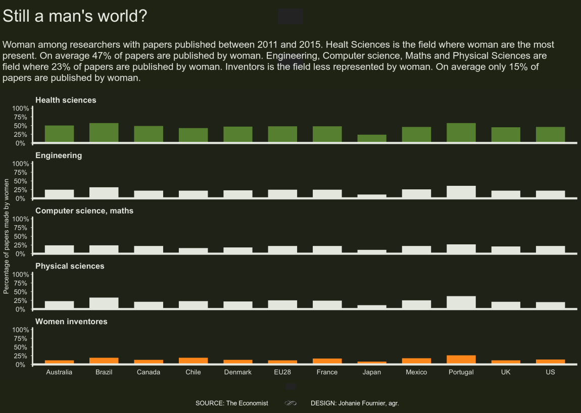
gg<-gg + annotate(geom="text", x=12.3,y=5, label="Healt Sciences is the field where\nwoman are the most present.\nOn average 47% of papers\nare published by woman.", color="#698F3F", size=4, hjust=0,vjust=0.9)
gg<-gg + annotate(geom="text", x=12.3,y=3, label="Engineering, Computer science,\nMaths and Physical Sciences are\nfield where 23% of papers\nare published by woman.", color="#E8EBE4", size=4, hjust=0,vjust=0.5)
gg<-gg + annotate(geom="text", x=12.3,y=1, label="Inventors is the field less\nrepresented by woman. On\naverage only 15% of papers\nare published by woman.", color="#FE9920", size=4, hjust=0, vjust=0.1)
- Posted on:
- January 13, 2019
- Length:
- 2 minute read, 423 words
- Categories:
- rstats tidyverse tidytuesday
- Tags:
- rstats tidyverse tidytuesday